Work In Progress 2


All members of Trekkers are thrilled to share our second work-in-progress update and introduce the first pre-release (v0.1.0) of Trek.
In Progress 2, we have finalized our app structure, including the high-level React component structure, and developed front-end interfaces for the main features of our minimal viable product (MVP).
High-Level Overview
The pages of our web application are categorized into three main groups:
- Main Pages: Landing Page, Public Profile Page, etc.
- Trip App Pages: Overview, Details, Analytics Pages
- Settings Pages: User Profile/Account Settings Page
Each of these pages consists of various sub-components. For Progress 2, we have developed some of these core pages and their sub-components that define our MVP.
Tech Stack
TypeScript
We chose React with TypeScript for this phase. TypeScript offers type safety, is an industry standard, and all Trekkers members have experience working with it.
Tailwind CSS
We integrated Tailwind CSS for easier and faster development of styled components. Justin Lieu has led the team in implementing Tailwind during the development process.
Mantine UI
We also utilized Mantine, a popular React UI Component library. After comparing MUI, Chakra, and Mantine, we chose Mantine for its diverse components and ease of customization.
Key Pages and Features
Landing Page
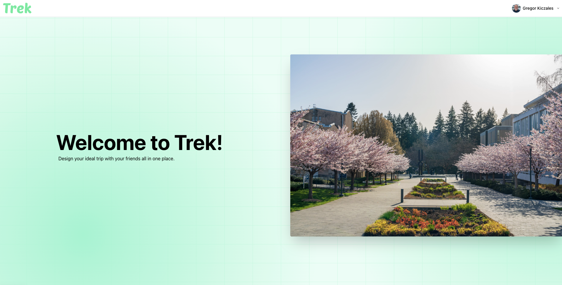
Our landing page provides a brief description of the application, includes short card components related to travel, and features a newsletter signup.
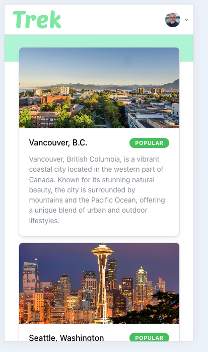
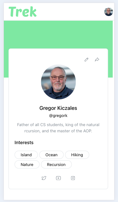
Profile Page
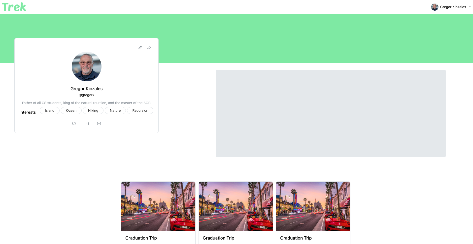
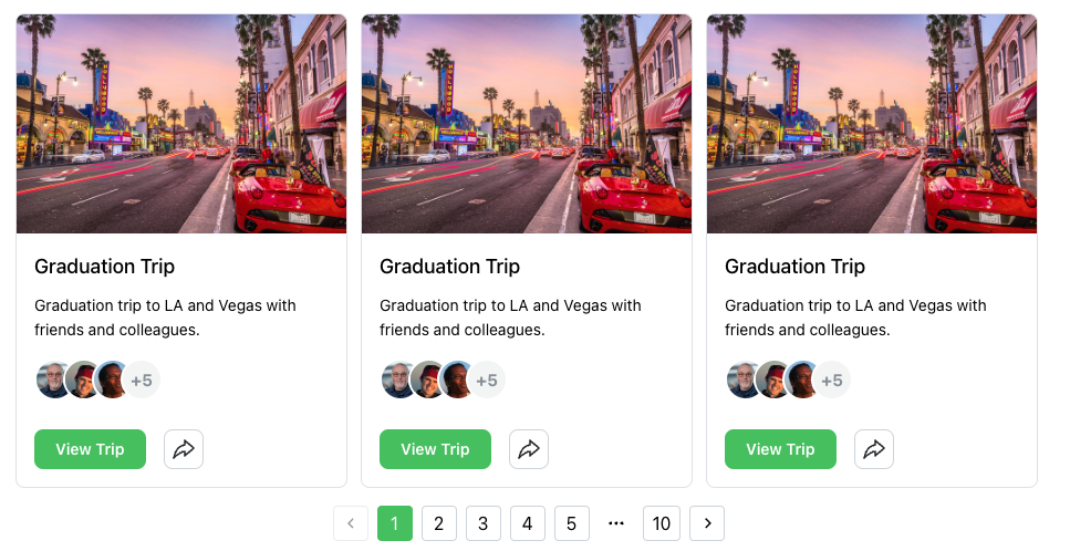
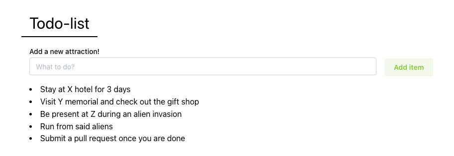
As mentioned in Progress 1, the profile page displays all trips associated with a user, allowing them to browse through their trips conveniently.
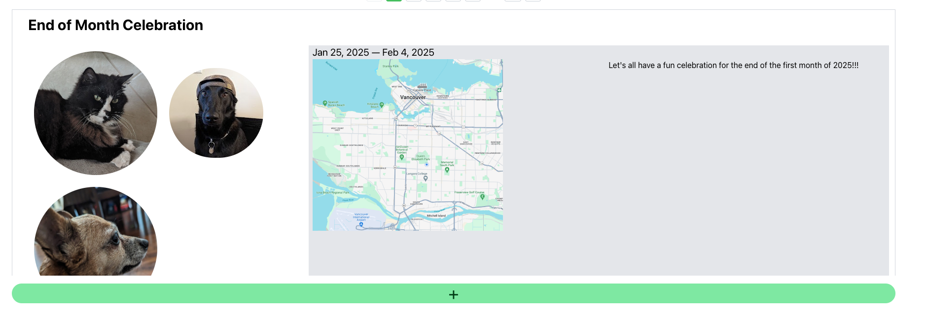
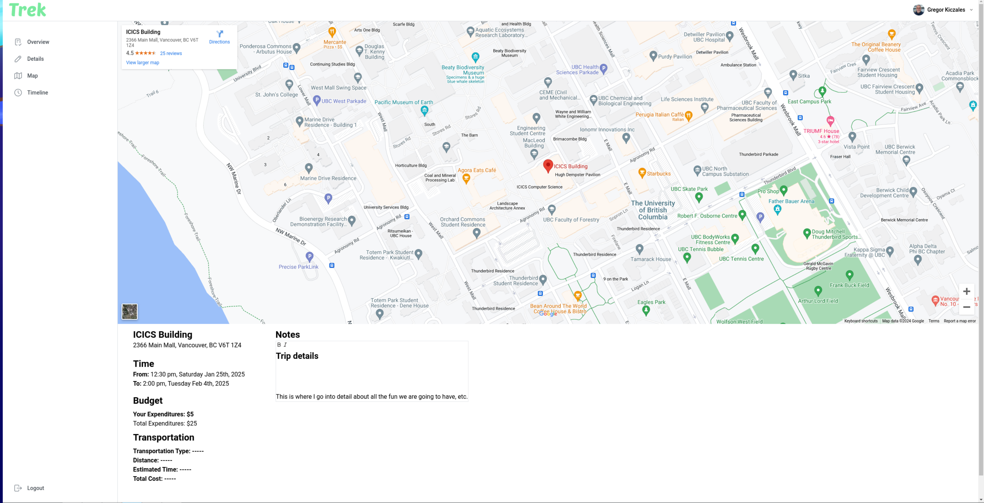
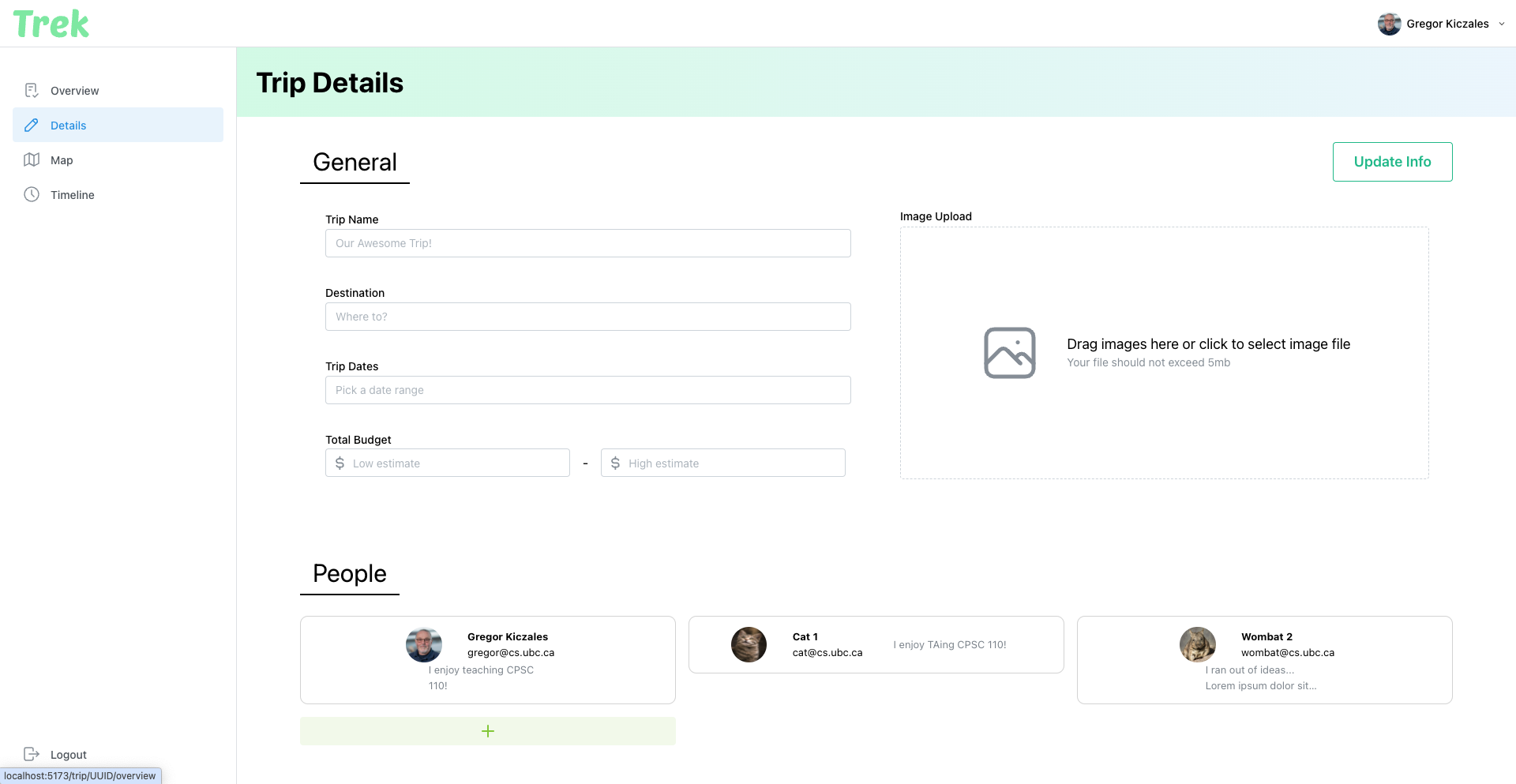
Trip Planning Page
The Trip Planning page is one of the main features of our application, consisting of four subpages: Overview, Details, Map, and Timeline.
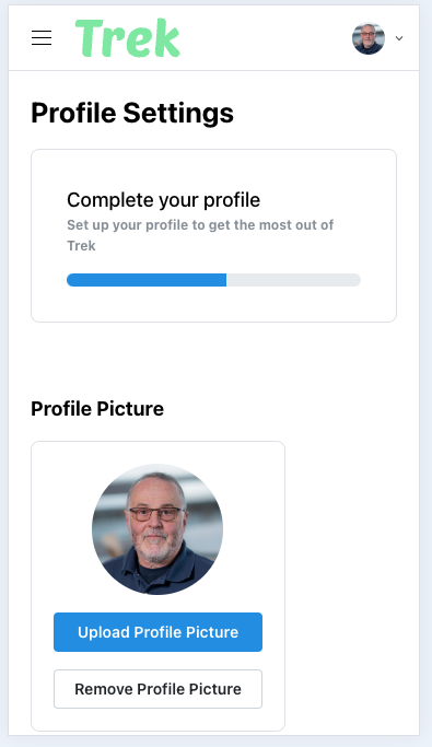
Settings Page
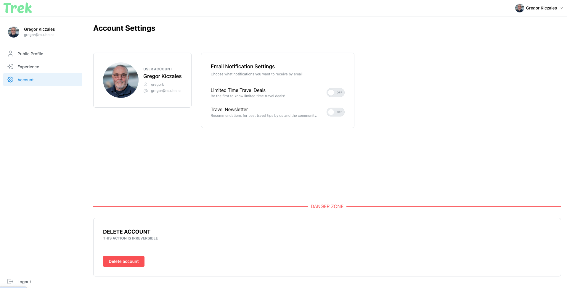
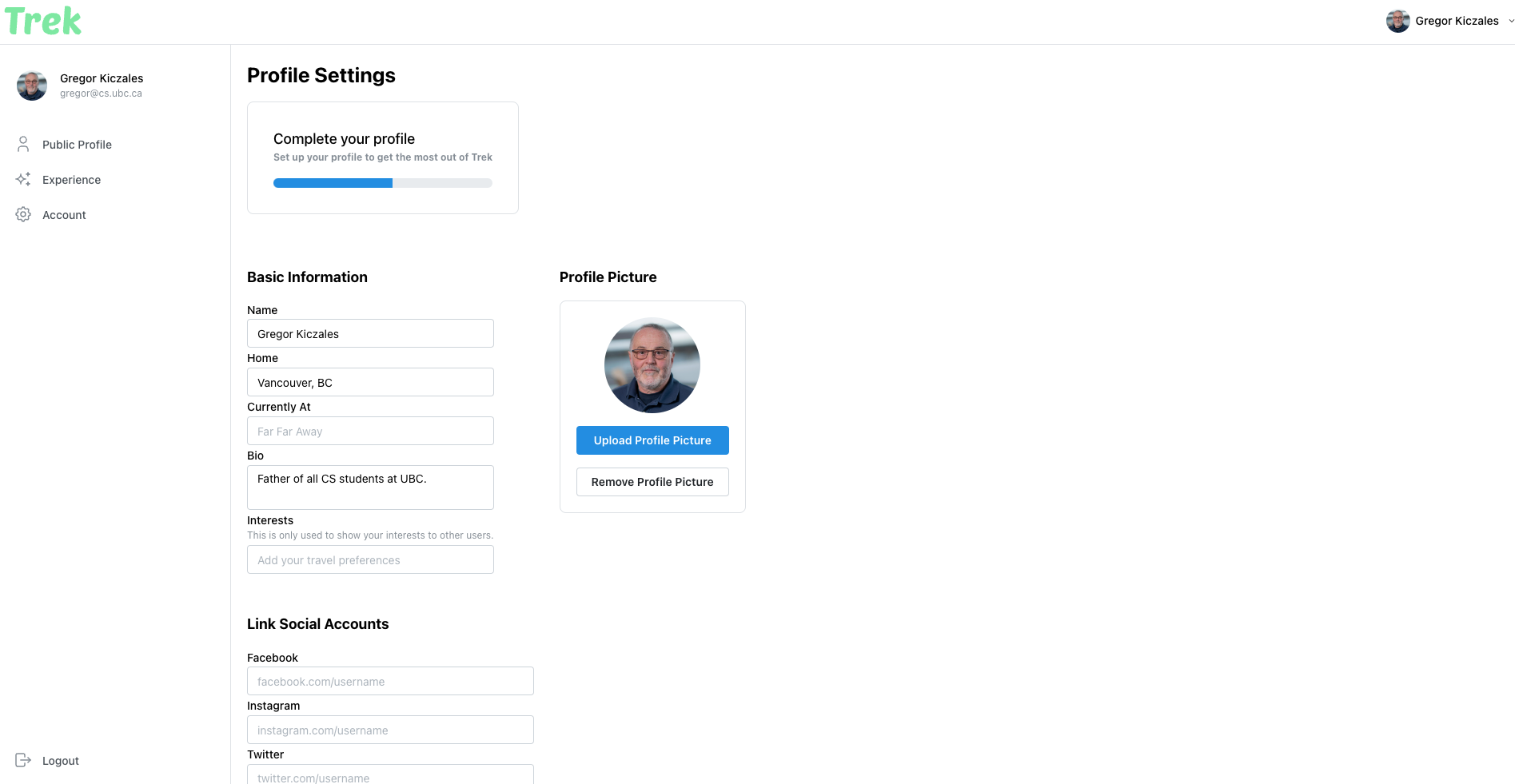
The Settings page includes Account Settings and Public Profile Settings, enabling users to manage their profiles and account preferences.
Stay tuned for more updates as we continue to refine and enhance Trek!